Introduction
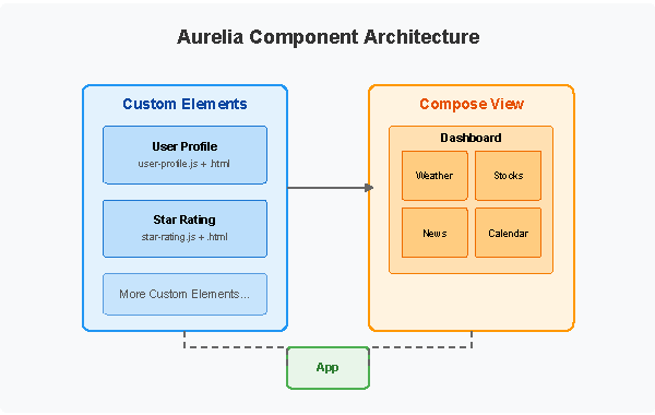
Aurelia is a powerful, modern JavaScript framework designed for building responsive and feature-rich web applications. Among its many strengths are its component-based architecture and flexible templating system. Two essential features that exemplify these strengths are Aurelia Custom Elements and Compose. In this comprehensive guide, we’ll explore how these features work, their advantages, and how to implement them effectively in your Aurelia applications.
What Are Custom Elements in Aurelia?
Custom Elements are reusable, self-contained components that encapsulate HTML, JavaScript, and CSS into a single cohesive unit. They form the building blocks of Aurelia applications, allowing developers to create modular, maintainable code that’s easier to test and scale.
Key Benefits of Custom Elements
- Reusability: Create components once and use them throughout your application
- Encapsulation: Isolate functionality and reduce dependencies
- Maintainability: Simplify code organization and troubleshooting
- Testability: Test components in isolation from the rest of your application
- Team Collaboration: Enable multiple developers to work on different components simultaneously
Creating Custom Elements in Aurelia
Creating Custom Elements in Aurelia is straightforward and follows a convention-based approach. Let’s walk through the process with a practical example:
Basic Structure
A typical Custom Element consists of:
- A view template (HTML)
- A view-model (JavaScript class)
Step-by-Step Implementation
First, create a new file for your view-model, for example, user-profile.js:
javascriptCopyexport class UserProfile {
  @bindable user;

  constructor() {
    this.title = 'User Profile';
  }

  userChanged(newValue, oldValue) {
    // React to changes in the user property
    console.log(`User changed from ${oldValue?.name} to ${newValue?.name}`);
  }
}
Next, create the corresponding view template, user-profile.html:
htmlCopy<template>
  <div class="user-profile">
    <h2>${title}</h2>
    <div if.bind="user">
      <img src.bind="user.avatar" alt.bind="user.name">
      <h3>${user.name}</h3>
      <p>${user.bio}</p>
    </div>
    <div if.bind="!user">
      No user selected
    </div>
  </div>
</template>
Using Your Custom Element
Once created, you can use your Custom Element in other parts of your application:
htmlCopy<require from="./components/user-profile"></require>

<div class="container">
  <user-profile user.bind="selectedUser"></user-profile>
</div>
Advanced Custom Element Features
Shadow DOM Integration
Aurelia supports Shadow DOM, which provides stronger encapsulation for your components:
javascriptCopyimport {customElement, useView} from 'aurelia-framework';

@customElement('user-card')
@useView('./user-card.html')
export class UserCard {
  constructor() {
    this.shadowOptions = { mode: 'open' };
  }
}
Bindable Properties and Events
Enhance your components with bindable properties and custom events:
javascriptCopyimport {bindable} from 'aurelia-framework';

export class StarRating {
  @bindable value = 0;
  @bindable max = 5;

  valueChanged(newValue, oldValue) {
    // Handle value changes
  }

  rate(newValue) {
    this.value = newValue;
    this.dispatchEvent('change', { value: newValue });
  }

  dispatchEvent(name, detail) {
    const event = new CustomEvent(name, {
      bubbles: true,
      detail
    });
    this.element.dispatchEvent(event);
  }
}
Understanding Compose View in Aurelia
While Custom Elements are powerful, sometimes you need more dynamic behavior. This is where Aurelia’s Compose View comes in. The Compose View allows you to dynamically render components based on runtime conditions.
What is Compose View?
The Compose View is a special element in Aurelia that can dynamically load and render components at runtime based on application state. This creates extremely flexible UIs that can adapt to changing requirements.
Key Benefits of Compose View
- Dynamic Content: Change the displayed component on the fly
- Conditional Rendering: Show different components based on conditions
- Plugin Architecture: Support for plugin-based application architecture
- Content Management: Ideal for CMS-like functionality
Implementing Compose View
The basic syntax for the Compose View element is:
htmlCopy<compose view-model.bind="dynamicComponent"></compose>
Basic Example
Here’s a simple example of using Compose View to switch between different components:
javascriptCopyexport class Dashboard {
  constructor() {
    this.availableWidgets = ['weather', 'stocks', 'news', 'calendar'];
    this.currentWidget = 'weather';
  }

  get dynamicComponent() {
    return `./widgets/${this.currentWidget}`;
  }

  switchWidget(widgetName) {
    this.currentWidget = widgetName;
  }
}
And in your template:
htmlCopy<template>
  <div class="dashboard">
    <div class="widget-selector">
      <button repeat.for="widget of availableWidgets"
              click.delegate="switchWidget(widget)"
              class="${widget === currentWidget ? 'active' : ''}">
        ${widget}
      </button>
    </div>

    <div class="widget-container">
      <compose view-model.bind="dynamicComponent"></compose>
    </div>
  </div>
</template>
Advanced Compose Options
The Compose element offers several binding options:
view-model: The component class to instantiatemodel: Data to pass to the componentview: The HTML template to useview-model-settings: Additional configuration
Here’s an example using more compose options:
htmlCopy<compose
  view-model="./widgets/weather-widget"
  model.bind="{ location: userLocation, units: 'metric' }"
  view-model-settings.bind="{ mode: 'detailed' }">
</compose>
Combining Custom Elements and Compose View
The real power comes from combining these two features. You can create a library of Custom Elements and then use Compose View to dynamically select which ones to display.
Implementation Example
Create a dynamic form builder that selects the appropriate form field types:
javascriptCopyexport class DynamicForm {
  constructor() {
    this.formFields = [
      { type: 'text', name: 'username', label: 'Username' },
      { type: 'password', name: 'password', label: 'Password' },
      { type: 'checkbox', name: 'remember', label: 'Remember me' },
      { type: 'select', name: 'country', label: 'Country',
        options: ['USA', 'Canada', 'UK', 'Australia'] }
    ];
  }

  getFieldComponentPath(fieldType) {
    return `./form-fields/${fieldType}-field`;
  }
}
And in your template:
htmlCopy<template>
  <form>
    <div repeat.for="field of formFields" class="form-group">
      <label for="${field.name}">${field.label}</label>
      <compose
        view-model.bind="getFieldComponentPath(field.type)"
        model.bind="field">
      </compose>
    </div>
    <button type="submit">Submit</button>
  </form>
</template>
Performance Considerations
While Custom Elements and Compose View are powerful, they come with performance implications to consider:
Custom Elements Performance Tips
- Use the
@containerlessdecorator for elements that don’t need their own container - Consider using
@noViewfor elements that only need JavaScript logic - Implement proper lifecycle methods like
detached()to clean up resources
Compose View Performance Tips
- Compose is more expensive than direct inclusion of elements
- Cache dynamically loaded components when possible
- Use
view-cache="true"to enable caching of views
javascriptCopy// Example of caching components
export class ComponentCache {
  constructor() {
    this.cache = new Map();
  }

  getComponent(name) {
    if (!this.cache.has(name)) {
      const component = this.loadComponent(name);
      this.cache.set(name, component);
    }
    return this.cache.get(name);
  }

  loadComponent(name) {
    // Load component logic
  }
}
Best Practices for Custom Elements and Compose View
To make the most of these features, consider following these best practices:
Custom Elements Best Practices
- Keep elements focused on a single responsibility
- Use bindable properties for configuration
- Implement lifecycle hooks appropriately
- Document your elements for team use
- Create a component library for reuse across projects
Compose View Best Practices
- Use with purpose, not as a default pattern
- Consider performance implications of dynamic loading
- Implement error handling for missing components
- Cache frequently used components
- Consider using a state management pattern for complex component switching
Real-World Example: Building a Dynamic Dashboard
Let’s integrate everything we’ve learned into a comprehensive example – a dynamic dashboard application:
javascriptCopy// dashboard-manager.js
export class DashboardManager {
  constructor() {
    this.availableWidgets = [
      { id: 'weather', name: 'Weather', icon: 'cloud' },
      { id: 'stocks', name: 'Stocks', icon: 'trending-up' },
      { id: 'news', name: 'News', icon: 'newspaper' },
      { id: 'calendar', name: 'Calendar', icon: 'calendar' }
    ];

    this.userDashboard = [
      { id: 'w1', type: 'weather', position: 'top-left', settings: { location: 'New York' } },
      { id: 's1', type: 'stocks', position: 'top-right', settings: { symbols: ['AAPL', 'MSFT', 'GOOG'] } },
      { id: 'n1', type: 'news', position: 'bottom', settings: { sources: ['tech', 'business'] } }
    ];
  }

  getWidgetPath(type) {
    return `./widgets/${type}-widget`;
  }

  addWidget(type, position) {
    const id = `${type.charAt(0)}${this.userDashboard.length + 1}`;
    this.userDashboard.push({
      id,
      type,
      position,
      settings: this.getDefaultSettings(type)
    });
  }

  removeWidget(id) {
    const index = this.userDashboard.findIndex(w => w.id === id);
    if (index !== -1) {
      this.userDashboard.splice(index, 1);
    }
  }

  getDefaultSettings(type) {
    // Return default settings based on widget type
    const defaults = {
      weather: { location: 'Current Location' },
      stocks: { symbols: ['AAPL'] },
      news: { sources: ['general'] },
      calendar: { view: 'month' }
    };
    return defaults[type] || {};
  }
}
htmlCopy<!-- dashboard-manager.html -->
<template>
  <require from="./components/widget-container"></require>

  <div class="dashboard-header">
    <h1>My Dashboard</h1>
    <div class="widget-selector">
      <div repeat.for="widget of availableWidgets"
           click.delegate="addWidget(widget.id, 'center')"
           class="widget-option">
        <i class="icon-${widget.icon}"></i>
        <span>${widget.name}</span>
      </div>
    </div>
  </div>

  <div class="dashboard-grid">
    <widget-container
      repeat.for="widget of userDashboard"
      widget-id.bind="widget.id"
      widget-type.bind="widget.type"
      widget-position.bind="widget.position"
      widget-settings.bind="widget.settings"
      on-remove.call="removeWidget(widget.id)">
    </widget-container>
  </div>
</template>
javascriptCopy// components/widget-container.js
import {bindable, customElement} from 'aurelia-framework';

@customElement('widget-container')
export class WidgetContainer {
  @bindable widgetId;
  @bindable widgetType;
  @bindable widgetPosition;
  @bindable widgetSettings;
  @bindable onRemove;

  get widgetComponent() {
    return `../widgets/${this.widgetType}-widget`;
  }

  remove() {
    if (this.onRemove) {
      this.onRemove();
    }
  }
}
htmlCopy<!-- components/widget-container.html -->
<template>
  <div class="widget-container ${widgetPosition}">
    <div class="widget-header">
      <h3>${widgetType} Widget</h3>
      <button click.delegate="remove()" class="remove-btn">×</button>
    </div>
    <div class="widget-content">
      <compose
        view-model.bind="widgetComponent"
        model.bind="widgetSettings">
      </compose>
    </div>
  </div>
</template>
Comparing Frameworks
So how does Aurelia’s way of putting components together stack up against other popular frameworks?
Aurelia vs. Angular
- Angular has a similar component-based setup but it makes use of more explicit decorators.
- Aurelia keeps things simple with its convention-over-configuration approach which means less boilerplate.
- Both frameworks let you load components on the fly but Aurelia’s Compose View is a bit more adaptable.
Aurelia vs. React
- React uses JSX for its components whereas Aurelia sticks with separate HTML templates.
- React leans more towards JavaScript when composing components.
- Aurelia’s two-way binding makes it easier to handle forms.
Aurelia vs. Vue
- Both Vue and Aurelia use HTML templates with unique attributes.
- Vue tends to go for single-file components while Aurelia usually separates the view from the view-model.
- Both frameworks do a great job supporting dynamic components.
Conclusion: Aurelia Custom Elements and Compose
Custom Elements and Compose View are two of Aurelia’s most powerful features, enabling developers to create flexible, modular applications that can adapt to changing requirements. By mastering these concepts, you’ll be able to build more maintainable and scalable web applications.
Remember these key takeaways:
- Custom Elements provide reusable components that encapsulate HTML, JavaScript, and CSS
- The Compose View enables dynamic component rendering based on runtime conditions
- Combining these techniques allows for highly adaptable user interfaces
- Consider performance implications and follow best practices for optimal results
With these tools in your Aurelia development arsenal, you’ll be well-equipped to tackle complex application requirements while maintaining clean, maintainable code.
Further Resources
- Official Aurelia Documentation
- Aurelia GitHub Repository
- Aurelia Discourse Community
- Aurelia on Stack Overflow
Aurelia Custom Elements and Compose (FAQs)
1. What is the difference between Custom Elements and Custom Attributes in Aurelia?
Answer: While both are ways to extend Aurelia’s capabilities, they serve different purposes:
- Custom Elements are full components with their own view and view-model. They create new HTML elements and typically encapsulate complex functionality or UI sections. For example,
<user-profile>might render a complete user information card. - Custom Attributes enhance existing elements by adding behavior or transforming their appearance. They don’t have their own view and are applied to existing elements. For example,
<div tooltip="Help text">adds tooltip functionality to a div.
Choose Custom Elements when you need a reusable UI component with its own template, and Custom Attributes when you want to add behavior to existing elements.
2. How do I pass data to dynamically composed components?
Answer: When using the Compose element, you can pass data to dynamically loaded components using the model binding:
htmlCopy<compose
  view-model.bind="dynamicComponent"
  model.bind="dataForComponent">
</compose>
In your dynamically loaded component, implement the activate lifecycle method to receive the data:
javascriptCopyexport class DynamicComponent {
  activate(model) {
    // model contains the data passed via model.bind
    this.data = model;
  }
}
This allows you to configure the component based on the context in which it’s being used.
3. How can I improve performance when using many Custom Elements?
Answer: When using many Custom Elements, consider these performance optimizations:
- Use @containerless decorator for elements that don’t need their own DOM container: javascriptCopy
import {containerless} from 'aurelia-framework'; @containerless() export class LightweightElement { // Implementation } - Implement proper disposal in the
detached()lifecycle method: javascriptCopyexport class MyElement { detached() { // Clean up subscriptions, timers, etc. this.subscription.dispose(); } } - Lazy load components that aren’t immediately needed: javascriptCopy
import {PLATFORM} from 'aurelia-framework'; // In your configuration aurelia.configure(config => { config.feature(PLATFORM.moduleName('features/some-feature')); }); - Use value converters instead of computed properties for simple transformations to reduce change detection overhead.


